The Butter Yellow Edit
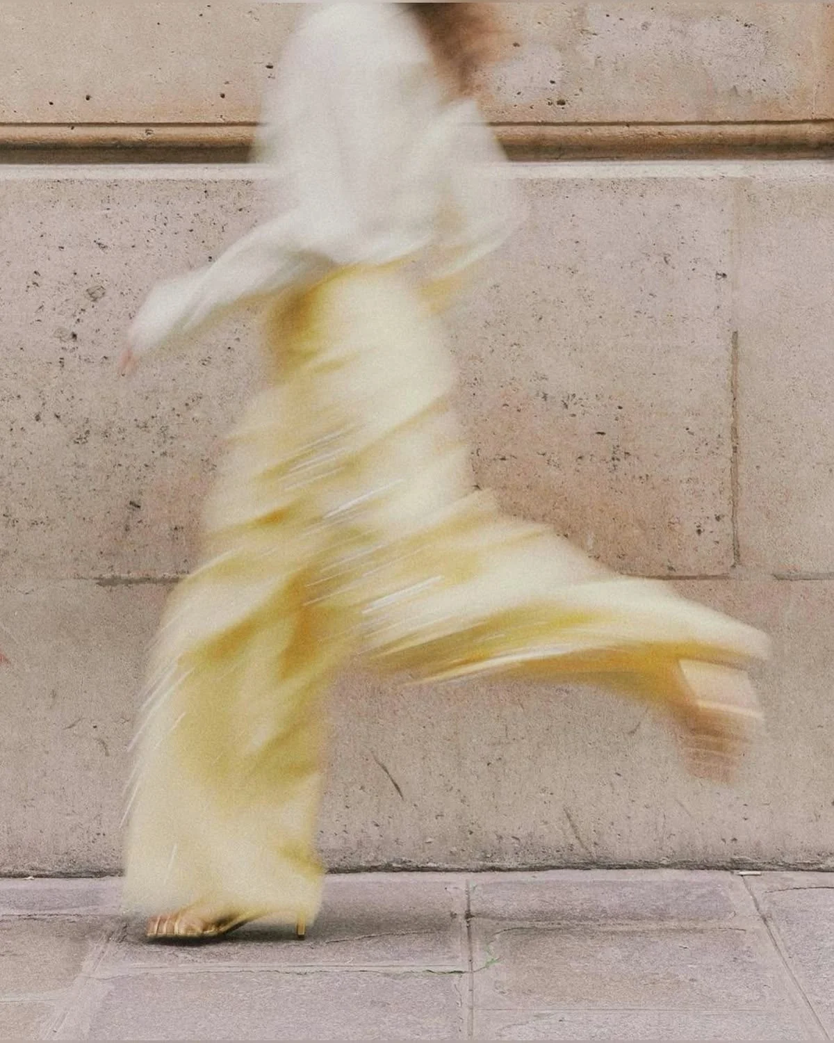
Image source Pinterest > Yashaswini Angiras
In recent years, like a slow warm sunrise, butter yellow has been gaining popularity…
When used in the right amounts, yellow in of itself is a colour often associated with happiness, optimism and sunshine, and the muted more mellow version, butter yellow, boasts all of these attributes in a light, playful and elegant way.
I’m keen to explore this colour in more detail. How can we use it? What are some of the common mistakes made when using butter yellow, and most importantly, is it a colour that has staying-power or will we see it fade out?
Why butter yellow is having a moment
After years of muted neutrals and icy tones dominating interiors and fashion alike, butter yellow is the glow many people didn’t know they needed. It’s optimistic without being too loud. Not quite neutral but not quite a colour splash. It’s sunny yet sophisticated. A colour that instantly lifts a room or outfit without feeling over the top.
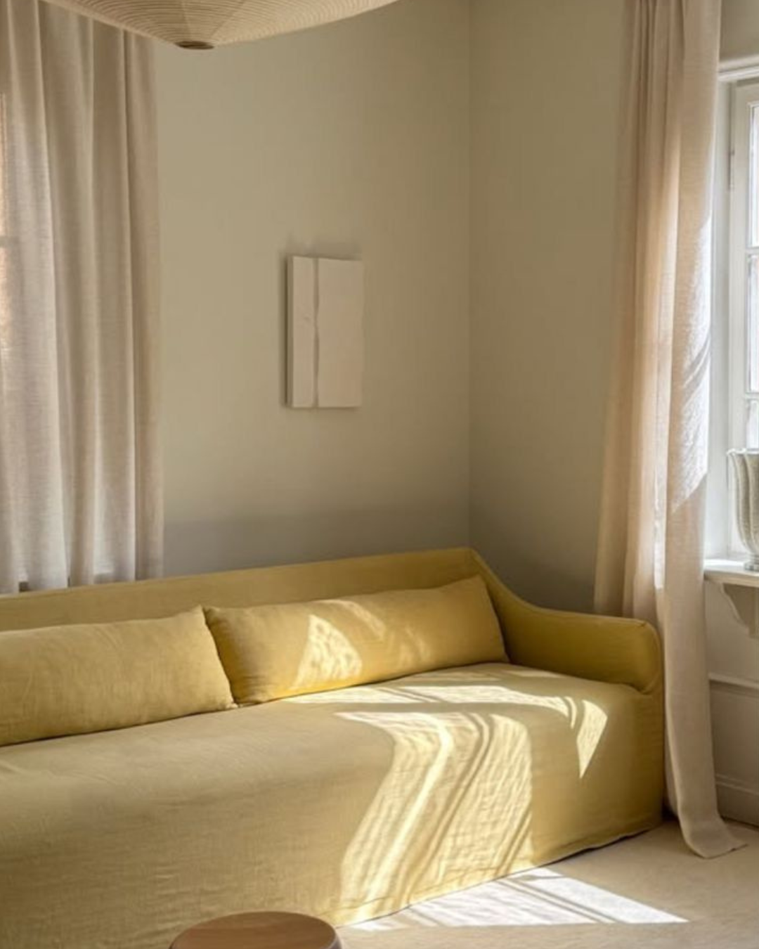
Soft Elegance
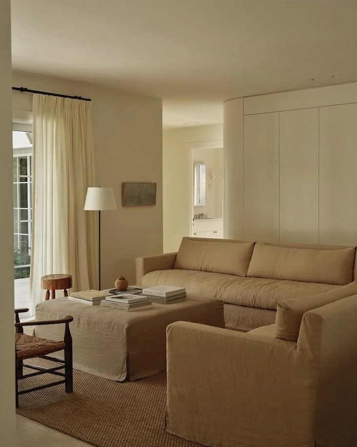
A minimalist couch slip cover in butter yellow set against soft creams, white and beige. Image source > Pinterest > michael guidry
Enduring or fleeting?
The biggest question most people wonder when it comes to colour is, ‘Is it just a phase, or is it here to stay?’
I have many clients who pull back on using certain types of colour because they’re worried that it will make their interiors either date over time, or, they’ll get sick of it. It can feel like a big decision so having an understanding about a particular hue can be very informative when it comes to the selection of colours.
The colour butter yellow has gained some traction over the last couple of years.
Looking back, it’s certainly had its moments in both interiors and fashion across the decades.
Princess Diana is widely credited with making the shade a fashion signature, famously wearing a butter yellow Chanel suit to Wimbledon in 1995.
If I look at those pictures, the colour feels elegant and controlled in a way that’s fresh and graceful.
It seems butter yellow is not a fleeting trend, perhaps more of a classic to be claimed.
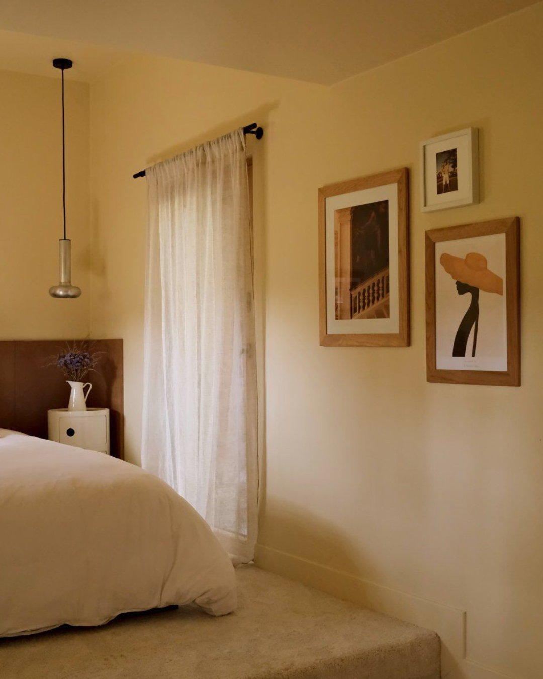
Muted browns, light creams and a touch of black complement gentle yellow walls - Image source > Pinterest.
Using butter yellow today
Butter yellow thrives against restrained, elegant tones. Think spring. Soft blues, crisp whites, earthy browns and foliage greens. Or, for a lovely contrast, you could go for deeper, more moody colours to create a rich visual tension.
Tone it down to a refined and tasteful approach, or play it up for a fun contemporary edge.
Where to use butter yellow?
Walls, upholstery, or accent furniture - anywhere you want warmth without heaviness. I feel like butter yellow could be really fun in kids rooms too.
Personally, this is not a colour I would use to colour drench my space with though. I’d use it as a very subtle muted back drop and then layer in other complimentary colours into the scheme. Or I’d use it in accent colours only.
I feel like too much of this colour in one place could result in the space feeling tacky and a bit of an over-kill, and lack the elegance that it’s renowned for. If you’re planning to create a space for the long-term, think of butter yellow as a colour that needs company - it’s not a solo player.
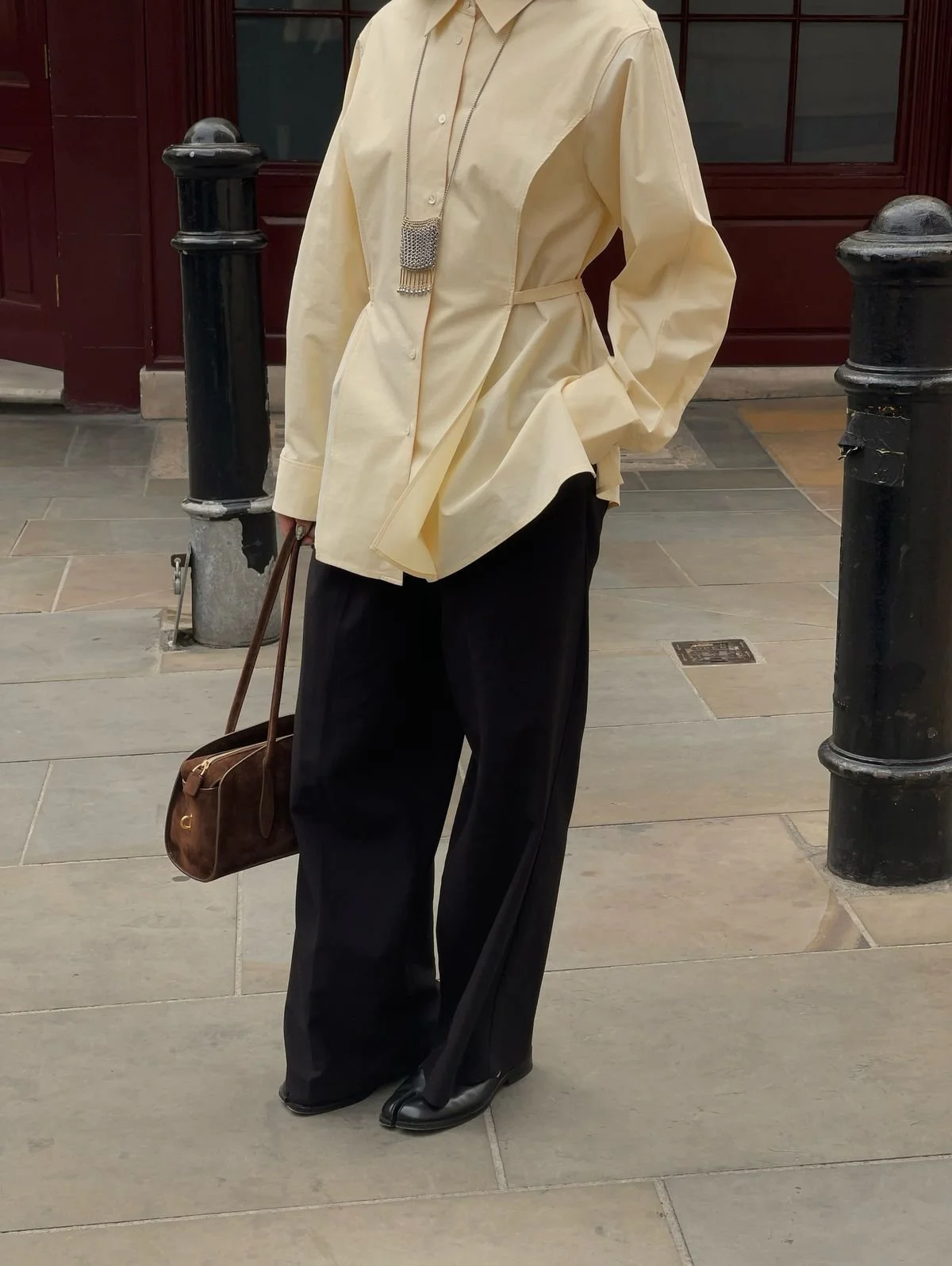
In fashion, a butter yellow coat, knit, silk scarf or cute summer dress elevates even the simplest outfit.
Let’s look at a few examples I’ve pulled together of how butter yellow can be used in quantity, application and alongside other colours…
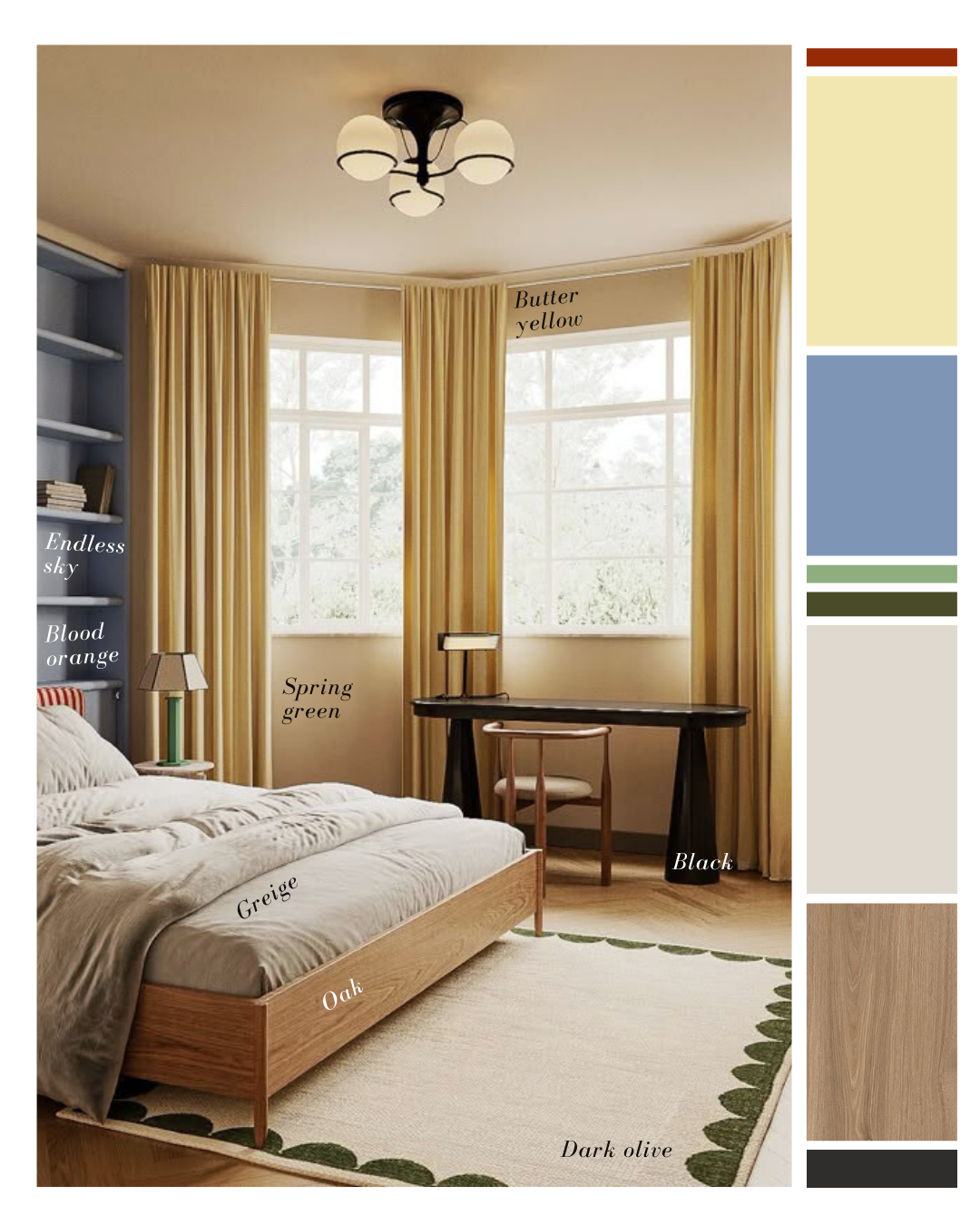
Example 1
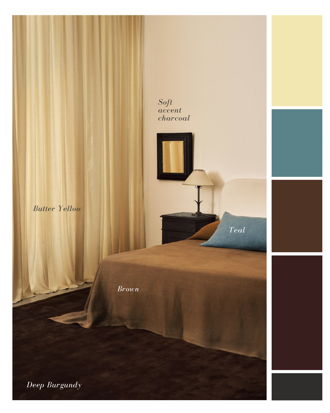
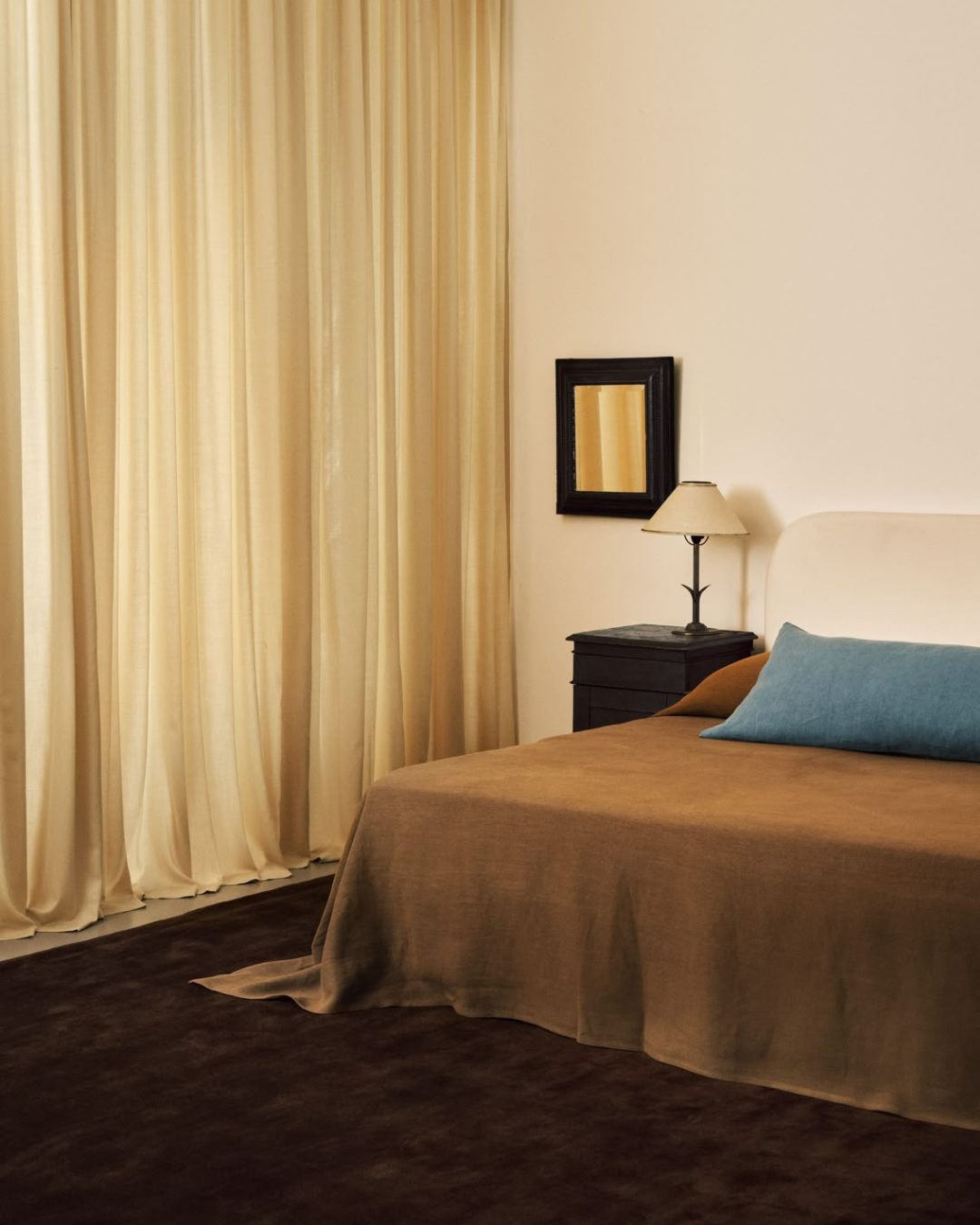
In Example 1, featuring an interior by Nordic Knots you can see the scheme comes together to create an eloquent and minimalist space using butter yellow as a calm and cocooning backdrop against an array of grounding colours such as brown, teal, burgundy and charcoal. This colour-play feels interesting and relaxing, all in one look.
Example 2
Example 2 from Leibel - Lera Brumina's Barrowgate Road residence - we see a more playful approach taken with the subtle incorporation of green and orange colour pops. With great proportions of both brighter colours and neutral tones, butter yellow feels like the seamless transition between them both.
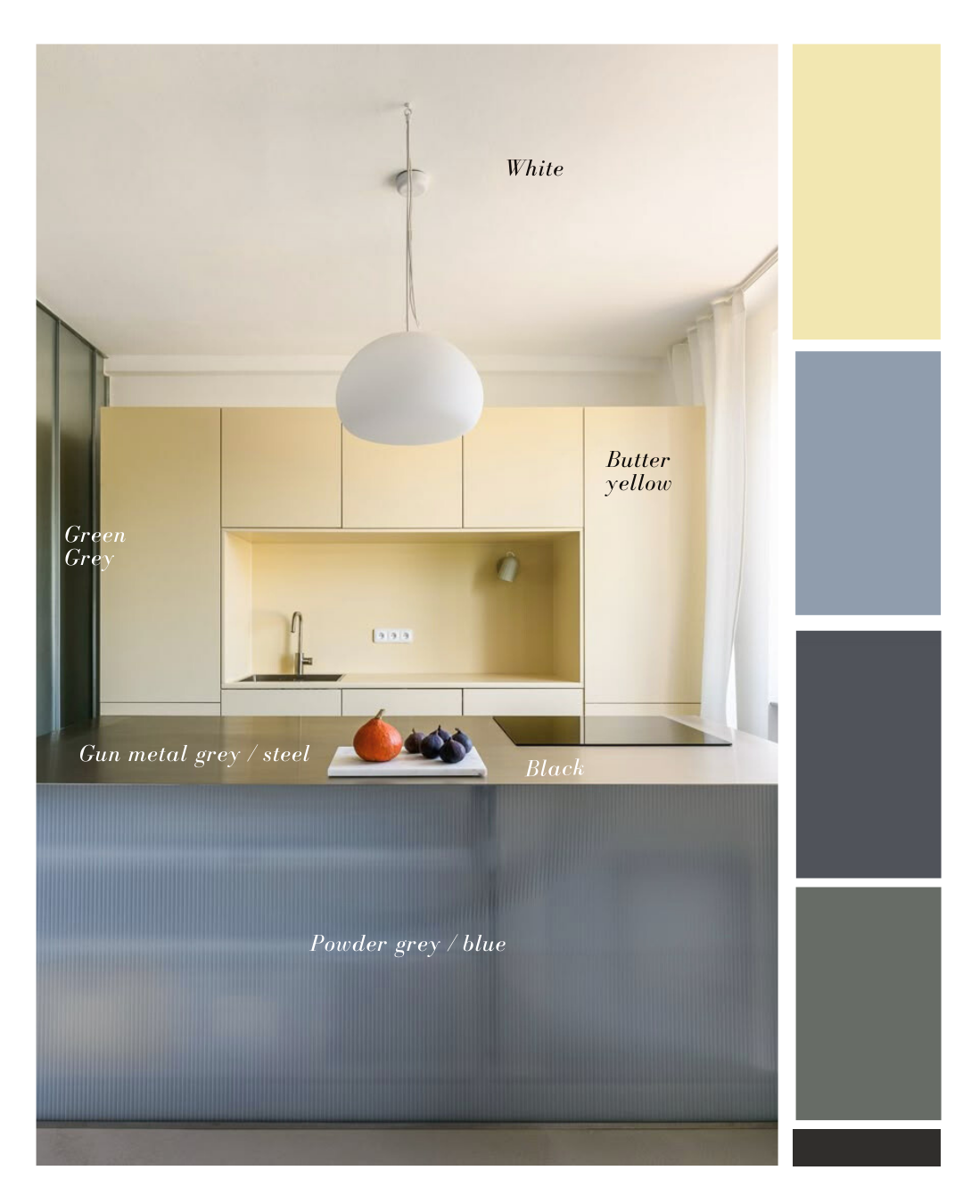
Example 3
Lastly in example 3 - another Leibel image from an interior designed by Alan Prekop - butter yellow has been used in a striking and modernistic scheme. Edgy cool metatics anchored in matte tones, balance the warm, creamy buttery shade of yellow against the crisp white ceiling. While the majority of this room is drenched in colour, it feels perfectly proportionate. The tones are all talking in the same language which feels calm yet unique. The result is a bold, chic, memorable space. I absolutely love it!
Common mistakes
I think butter yellow is one of those colours that when you get it right, the angels sing and when you get it wrong…let’s just say you might feel like starting over.
As mentioned, I wonder if this is a colour where too much, is too much? Keeping it considered with supporting colours in just the right quantities will keep the scheme feeling balanced and controlled.
The butter yellow effect
As it stands, butter yellow is a calm and quiet colour that offers a range of beautiful ways to lift your wardrobe, interiors or next event.
Play around and have fun with it - if I was using this colour, I’d be doing lots of mood boarding to explore the different combinations and possibilities to pair it with other colours and materials that speak to its full glory.
I think it’s a gorgeous colour that feels modern, soft, editorial, and endlessly versatile.
It’s sunshine with restraint. What do you think?