your complete guide to using colour
Colour is a phenomenon that can have a profound impact on how human beings relate to themselves and the world around them.
Interestingly, our colour preferences, just like all of our other likes and dislikes, are deeply varied and individualised based on a number of factors such as personal experience, culture or our complex evolutionary history.
It’s likely you have colour bias without even realising it. But understanding how you uniquely respond to colour can unlock interesting insights into your personality, personal expression and even the ability to better regulate and take care of your inner wellbeing.
But first, how does one visual input have such an impact on the human brain and body?
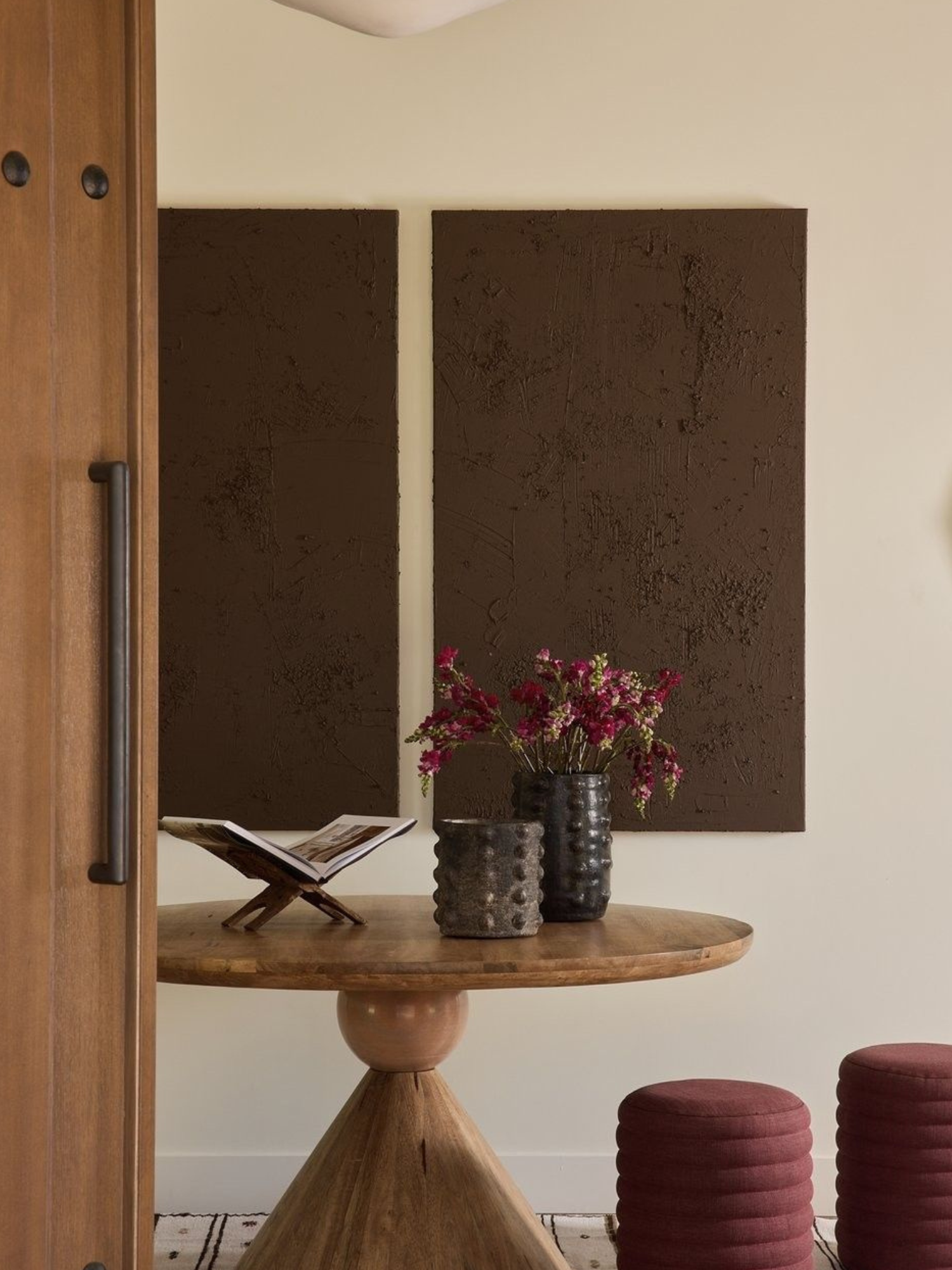
Image from Pinterest > Caroline Nyambura
HOW COLOUR WORKS
Colour travels on lightwaves which are all different lengths and which pulse at different speeds. The longest lightwave which pulses the slowest is what we perceive as red. The shortest lightwave which pulses the fastest is what we perceive as violet.
The colour you see on an object depends on the mix of light frequencies that reach your eye. If a surface doesn't absorb any colours, then all the colours are reflected, and you see white. If it absorbs all colours, none are reflected and you see black.
The eyes and brain process light into colours, influencing mood, attention, and even said to impact bodily functions like heart rate and blood pressure.
Colour is essentially a form of energy that stimulates psychological and physiological responses. This is fascinating because we often see energy as either coming from someone else - eg; ‘I need to protect my energy from said source’.
Or, we talk about our own energy levels - eg; ‘I’m tired’ or ‘I have no energy’.
But light energy as a source of colour has its own frequency that if we pay attention and tap into, could be used to enhance aspects of how we experience life!
Summed up by Psychology Today, colour is an important stimulus for the brain because a whopping 80 percent of our sensory impressions come from our visual system. Some research suggests that the pituitary gland, which is responsible for body temperature, energy level, sleep pattern, metabolism, and sexuality, is sensitive to colour stimulation (Gruson, L. 1982).
Image from Pinterest > Haven Decor
HISTORY - COLOUR AND HUMANS
Colour psychology has long been harnessed by marketers, brand strategists, designers of all kinds, and even therapists to help influence emotions, convey messages and drive specific behaviours.
And while wonderous, it’s nothing new. Dating back as far as the ancient Egyptians, colour has been used as a modality for health and healing. Well documented, sun-worshipping Egyptians harnessed the light wavelengths of colour by shining the rays of the sun through coloured crystals that would penetrate the body in specific locations which was thought to heal ailments.
According to Aspiral Design and described on numerous sources across the web, Egyptians built temples dedicated entirely to healing through light, with different rooms exclusively used for the healing powers of different colours.
In ancient Greece, the philosopher Aristotle also proposed that colours had psychological and physiological influences on individuals.
Colour was, and still is, used in Ayurveda, a traditional Indian medicine system that has been around for thousands of years.
Noted by Centre Colour, one of the earliest essays on colour theory was published in 1810 by German artist and politician Johann Wolfgang von Goethe. The Theory of Colour outlined the nature, function and psychology of colours, and although dismissed by many in the scientific community at the time, remains one of the leading explorations of the effects colours have on mood and emotion.
The advance of modern psychology developed the theory further, with Swiss psychiatrist Carl Jung becoming a prominent leader in the field. He stated that “colours are the mother tongue of the subconscious” and his findings led him to develop art therapies to help people overcome trauma.
Then, there’s nature which gives a much more simplistic representation of how we can connect colour with mood. Nature provides us with a lot of clues and associations of what colour could ‘mean’ just from how it shows up in the natural world. For example, the colour green can be linked to nature, balance and renewal. For many, that would likely generate an obvious positive impact.
KEY THINGS TO KNOW WHEN WORKING WITH COLOUR
Bright colours appear nearer than dark colours regardless of their hue. For example, a feature wall in bright blue (a cool colour) will appear to be closer than a feature wall in a darker red (warm colour).
Dark colours appear closer than light colours, making a room appear cosier.
Light colours appear further away, making a room appear larger or more spacious.
As we’ve explored, colour (depending on the person) can evoke key emotions, so understanding how a certain colour makes you feel will dictate the mood and energy of your space or creative project.
Here’s a basic list of common colour psychology rationale.
RED
A belief is that the colour red increases red blood cells, blood pressure, pulse rate and gastronomic juices. It’s linked to danger, passion, excitement, energy, courage, anger and revolution. In interiors red creates a lively environment and promotes sociability but personally, being such a strong colour, I’d only use it in small pops. Its variations - pink can be used to create a calm soft mood, and burgundy can be used to create a subdued, moody, cosy and even masculine energy.
BLUE
A belief is that the colour blue slows the heart rate, reduces muscular tension, slows breathing and hunger and even helps to stop nightmares. The colour is also associated with intelligence. It’s linked to a feeling of ease and spirituality, as well as, loyalty, serenity, protection, contemplativeness and reassurance. In interiors blue can create feelings of calmness, freshness and even energising spaces. Pale blue is said to enhance rest and sleep. Cobalt for energy and impact, ice blue for serenity and timelessness, and turquoise for a relaxed, inviting, feminine feel.
YELLOW
A belief is that the colour yellow in small amounts is great for mental and physical activity. The colour is also associated with joy, optimism, positivity, warmth and happiness - however when paired with black it can be used as a vivid warning system. Its variations - gold is often linked to success, achievement, glamour and sophistication. Pale yellow can be linked to joy and creativity.
GREEN
A belief is that the colour green reduces muscle tension, enhances concentration and meditation and is a great colour for feeling relaxed and peaceful. It’s linked to wellbeing associated with nature, stability, security and balance. In interiors green is said to aid concentration and peacefulness. Its variations - emerald represents love, luck, fertility, renewal and balance. Yellow-green can be playful and bold, while olive variations feel grounded, warm and natural.
ORANGE
A belief is that the colour orange aids digestion, and has similar effects on the body as red. It’s linked to communication, vibrancy, energy and warmth. In interiors depending on the tone, it can feel earthy and sociable. Its variations - tan, feels natural and welcoming, while apricot can give off soft and delicate vibes.
PURPLE
A belief is that the colour purple helps with mental problems and purifies the blood stream. Violet is said to slow the heart and stimulate immunity, while lilac can help with sleep and stress. It’s linked to sensuality, ambition, creativity, passion, dignity, arrogance, exclusivity, luxe and flamboyance. In subdued form purple in interiors is great for drama, mood and statements. Its variations - red-purple, is associated with creativity, while the softer lilac version is more heavenly and calming.
BROWN
A belief is that the colour brown gives a sense of strength, and reliability while being stabilising and grounding. It’s linked to warmth, security, earthiness and feelings of organic wholesomeness. In interiors brown can create a calm and soothing effect being great for comfortable and cosy living spaces. Its variations - beige is soft and neutral, while chocolate brown is rich and cosy.
WHITE
A belief is that white raises vibration and consciousness. It is said to create harmony, healing and protection. It’s linked to innocence, purity, peace, simplicity and cleanliness. In interiors, white can be used in almost any room and works well with other colours and textures. Its variations - yellow based whites add warmth, while blue-grey based whites are great for contemporary spaces with natural light.
GREY
A belief is that too much grey can stifle emotions and evoke feelings of isolation. It’s linked to a mix of broad influences such as calmness, depression, wisdom and detachment. In interiors, when working with grey, incorporate it with other colours and textures to add warmth and dimension. Its variations - silver is associated with glamour and femininity while its matte version can feel industrial, cool and edgy.
BLACK
A belief is that black absorbs negative energy and protects against external emotional stressors. It’s linked to drama, mystery, mourning, command, sophistication and intimacy. In interiors black can give off a moody and masculine vibe while also creating an edgy and intimate space. Its variations - matte, adds warmth and texture, while gloss creates drama and energy.
COLOUR COHESION
Of course the meaning of colour is much more relevant and personal when you bring a scheme together that uses a range of hues and tonal values that purposely and uniquely express the vision and feeling of your space.
How you arrange colour is the make or break. There must be a unity between the colours, regardless of whether their effect is calm and soothing or bold and energising.
Colour pairings are made up of two groups, harmonious which is a relaxed colour scheme and contrasting which is more bold and vibrant.
When using colour in space, it really comes down to how you want to use and connect with the room. Is it for downtime, chilling and limiting sensory input - or is it to conjure up a moment, make a splash and create an energetic atmosphere. Let’s dive into this further.
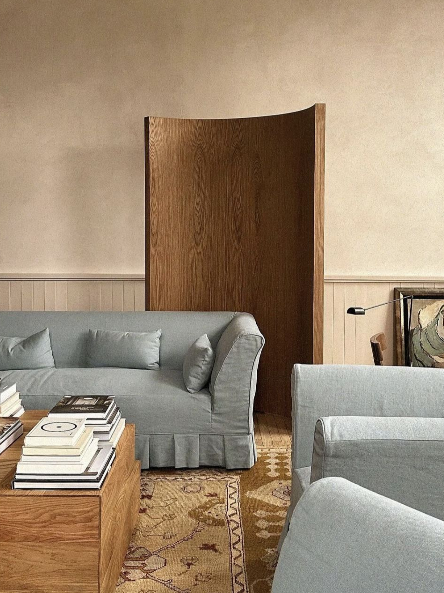
Image from Pinterest > Diana Yeary
COLOUR SCHEMES
Monochromatic, analogous or contrasting colour using complementary, split complementary or triadic schemes are a great way to begin putting your colours together. This is based on the colour wheel - here’s a nice little overview provided by Canva.
However, in short, monochromatic colour schemes are created by using various shades, tints, and tones of a single colour, to create a harmonious and unified look.
Analogous schemes are colours that sit beside each other on the colour wheel - they all belong to a primary colour/s and create a mood that feels calm, serene and relaxing.
Complementary schemes are used by using colours that are opposite for example green and red or blue and orange (or their variation versions). These schemes are often bold and create high impact environments, although you can tone them down.
HOW TO CHOOSE COLOUR
Because colour has such a significant impact on your personal sensory makeup, it is worth considering the importance of it - especially when it comes to the colour you choose to use in your home, business or in any digital or physical environment you're tasked with curating.
And this is more than just painting the walls - everything your eye touches has a colour, so arranging them in a way that makes visual sense to you, is what will create the desired impact you’re after - be it harmony, energy, peace or intimacy.
Before you start working with specific colours, you can ask yourself questions like…
What colours do I naturally like and are drawn to?
What mood do I want to create? Do I want to feel calm and harmonious? Do I want to create drama? Am I looking to make a splash?
What other lighting sources will impact my colour scheme - eg; natural or artificial lighting?
What other colour sources are around or are naturally occurring that may influence my colour choices? Eg; landscape and materials.
How do I want to use colour to manipulate the space - eg; make it feel bigger or smaller?
Are there key areas I want to hide or accentuate?
Who uses the space? How will my colour choices make an impact?
Then, start to develop out a colour scheme based on some of the ideas I’ve covered in this article.
COLOUR CONSULTANCY
A colour consult can be a really helpful tool to discover exactly what your colour goals are and how to curate a scheme that represents the outcomes of your desired project.
At Marx & Co, we offer colour consultancy sessions to help bring all of your ideas together so you can go away with a defined palette as well as clear guidance on how to execute it.
If you feel called to learn more, please don’t hesitate to email me directly - lou@loumarx.com
Of course, there is much to be said about gut instinct and going all in on what makes sense to you because colour is a deeply personal preference that will differ from person to person.
I feel the most important aspect to consider when it comes to colour is just that it does in fact matter. It will have an impact and make a big difference to your day to day living - and even perhaps your overall health and wellbeing.
For me, as a creative director who works with interiors and brands, it’s critical to understand how colour can enhance a person’s life.
I believe how we can use colour in our own environments to create spaces that are more uniquely responsive and connected to our emotional and physical needs has got to be a good thing!
By Lou Marx