Colour Palette Drop: Reserve N0.5
Reserve N0.5 feels like a fine wine. Fermented to perfection. Aged over time. Refined and elegant. Collected and chic. And, most importantly, both modern and timeless all in the same breath.
The essence of this colour palette is anchored in a depth that cuts beneath the surface. It’s anything but superficial. Because, as we’ve come to see in recent years, stark, white interiors have come and gone, but layered depth endures every time.
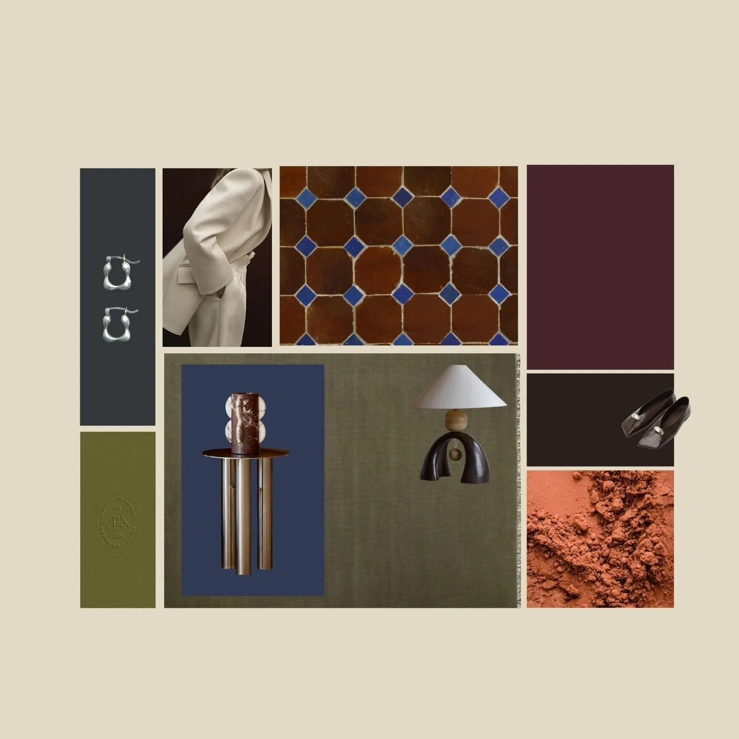
With Reserve N0.5, you’ll see an array of burgundies, chocolate browns, cool silvers, rich rusts, earthy greens, and mid-blues.
These contrasting complements form a palette that feels instinctive rather than styled. It’s grounded, confident, and quietly bold—exactly what great interiors are made of.
These colours work well because of their differences. Opposing in hue, they whisper in contrast without shouting. Warm tones like burgundy, rust and brown bring weight and richness; they anchor a space and make it feel lived-in, not staged.
Cool matte silvers and gloss chrome tones, along with midnight and mid-blues cut through that warmth with clarity, adding structure and a contemporary edge.
Earthy greens such as olive and kale sit between the two, acting as a natural mediator—organic, calming, and timeless. A balance that offers harmony and presence.
Curate your palette with Reserve N0.5
This palette isn’t about decoration - it’s about atmosphere. It’s a feeling more than a collection of colours.
It borrows from cellars, landscapes, stone, metal, and worn patinas —materials that age beautifully and never feel out of place.
Used well, this palette gives you an opportunity to create a designer-curated interior. It lends itself to all the hallmarks of true style - balance, restraint and substance.
I hope you enjoy diving into this colour play as much as I did! Let me know how you go. X